Transactions Redesign
Payana
Payana is a B2B payments platform that centralizes supplier payments, payroll, and collections for Latin American businesses — and this is the story of how we redesigned the transactions experience from the ground up.
- Date
- Q3 2024
- Role
- Sr. Product Designer
- Scope
- UX Research, Concept Development, UX/UI Design, Usability Testing, Post-launch Analysis
- Team
- PM, 2 backends, 1 frontend
01 — The Problem
Payana handles supplier payments, payroll, and collections for businesses. But to understand why the transactions panel was broken, you first need to understand how payments actually work on the platform.
Users don’t pay suppliers one by one. They go to Accounts payable, select multiple invoices from different suppliers, and hit “Pay now.” That single action creates one batch — but Payana then generates one individual disbursement per supplier, all processed through Cobre, their external payment provider. Once the payment left Payana’s hands, they lost visibility entirely. They had to wait for Cobre’s response to know if it went through or got rejected.
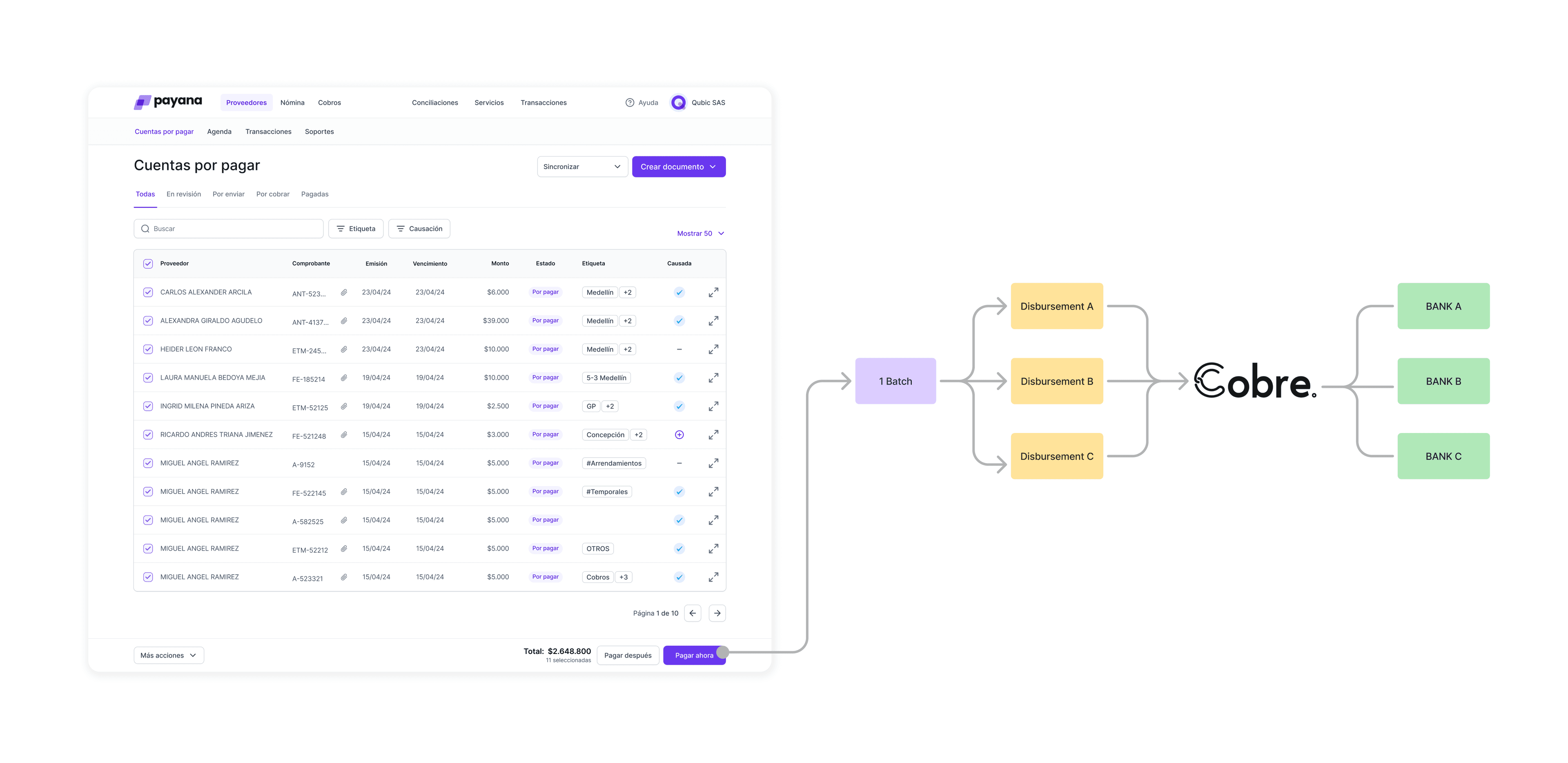
One user action. Multiple bank transfers. That gap between what Payana showed and what the bank recorded is where everything broke down.
A user who paid 10 suppliers in one batch saw 10 separate transfers on their bank statement — with no way to reconcile them inside Payana. And if any disbursement got rejected, they had no idea. No error message, no notification. Someone at the back office had to step in.
“Are there transactions? I didn’t know.”
The result: nobody was using the transactions panel. Not because they didn’t need it. Because they didn’t know it was there — and when they did find it, it didn’t tell them anything useful.


02 — Research & Discovery
Two rounds of interviews, same 4 users — some on the paying side, some on the receiving side, all with at least 6 months on the platform. The two-round structure was intentional: first session to understand the pain, second to validate we were solving the right thing.

Round 1 — Understanding the current experience.
Open questions about how they were actually using transactions, and what they expected from it. The pain points that came back were consistent — and pretty damning.
“As it is currently, I never open it because I think all the details of the TRX are too far away.”
“Currently, you lose if a payment is rejected.”
“I don’t always find the information I need quickly.”
Three things kept coming up: you couldn’t see everything in one place, you had no control when a payment failed, and finding specific transactions was a pain. None of it was about missing features — the information existed. It just wasn’t surfaced.
The interviews told us what users felt. The product analysis told us why.
Alongside the interviews, I mapped the transaction model from scratch — how a single payment action generates multiple bank disbursements, how pay-ins and pay-outs relate, how a rejection propagates through the system. You can’t design something legible without first understanding what it actually is. This step wasn’t optional.
Round 2 — Validating the direction.
Before touching high fidelity, I showed those same users two rough mockups of a unified view. The reaction was fast.
“It’s super intuitive.”
“It is more condensed and seeing them in one place seems better to me.”
“I think it is very good, the information is clear, showing what is in process and what has been paid.”
Testing the concept before the design meant we went into the build phase with actual signal, not gut feel.
02b — The Real Design Challenge
Understanding the transaction model.
Payana’s payment model isn’t like a standard bank transfer. Users don’t pay one supplier at a time — they batch invoices from multiple suppliers into a single payment action. Payana handles the disbursements. One click from the user kicks off a whole cascade of individual bank transfers in the background.
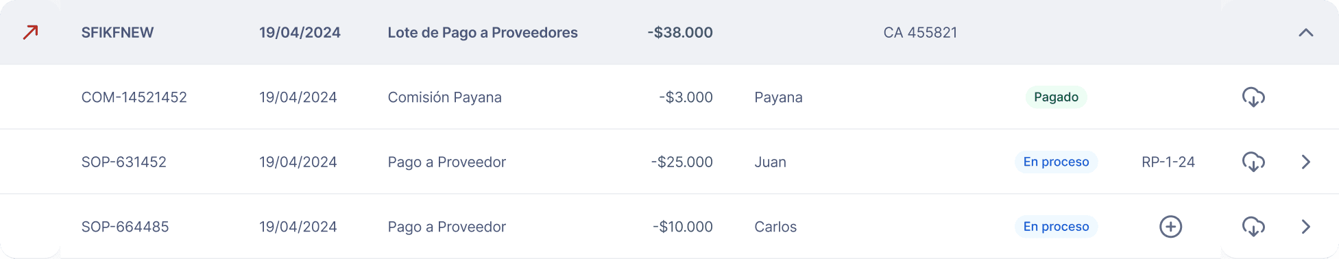
That created the core visibility problem: what you saw in Payana bore no obvious relationship to what your bank statement showed. A single $90 lote in Payana could be five separate movements at the bank — and your accounting team had no way to reconcile them without picking up the phone.
We mapped three possible transaction models before deciding on the structure.
This wasn’t just a visual problem — it was an architectural one. How do you represent a transaction that contains invoices from multiple suppliers?
Option 1: Group by supplier — one transaction per supplier. Cleaner at a glance, but Payana lets you mix suppliers in a single batch, so retroactive grouping breaks down fast.
Option 2: One transaction per invoice — maximum granularity, closest to how accounting systems think. But it fragments a single payment action into dozens of rows and loses the thread entirely.
Option 3 (chosen): A lote consolidates everything from a single payment action into one parent transaction, with each supplier’s individual pay-out visible underneath. This keeps the user’s mental model intact (“I made one payment”) while giving them the full breakdown when they need it.
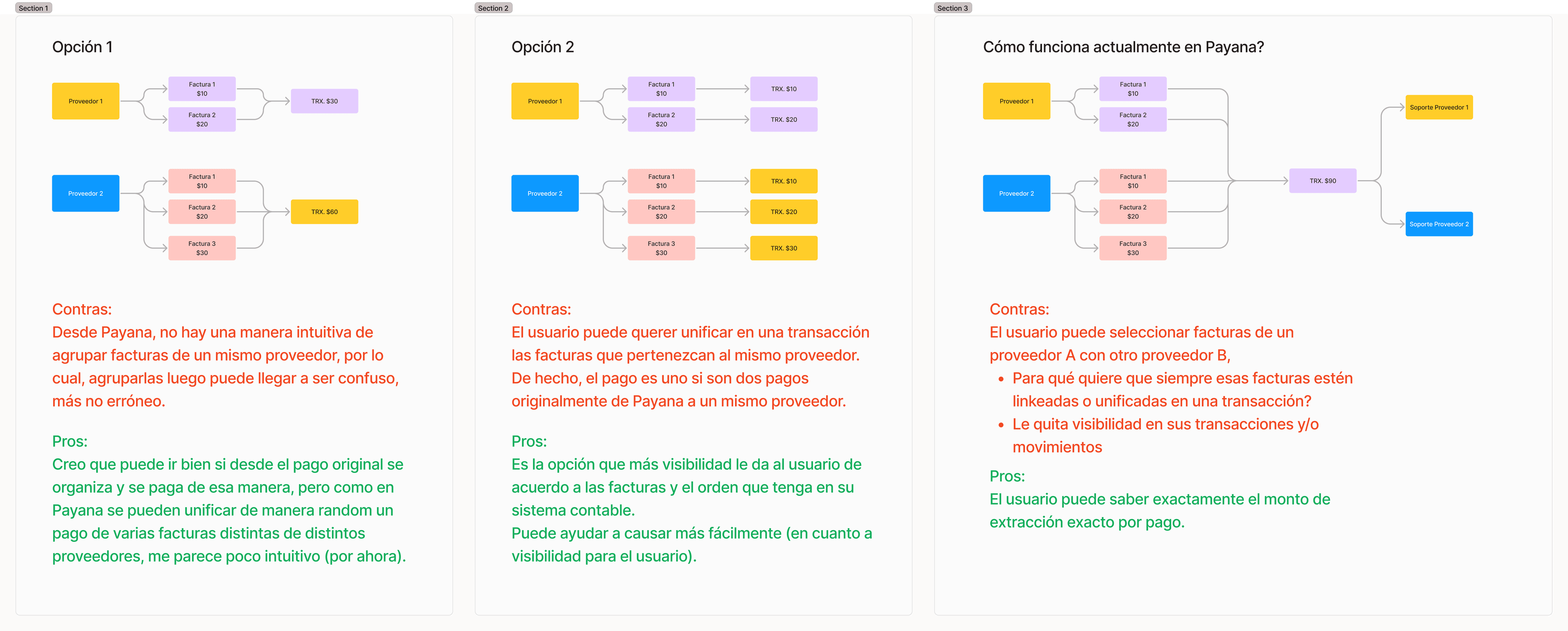
We went with Option 3 — not because it was the simplest, but because it was the most honest. The lote is what the user did. The pay-outs are what the bank saw. The goal was to make both visible and make them match.
The rejection flow was the most operationally significant problem.
When a pay-out got rejected — at the Cobre level or the bank level — the whole resolution was manual: support got a WhatsApp notification, copied the transaction code, edited data in a back-office tool, and reprocessed the payment. The user had no idea what happened or why.
The redesign flipped that entirely. Rejection reason right there in the transaction detail. Users can edit beneficiary data and reprocess on their own. If they need a refund instead of a retry, that path is there too — no support call needed. Every reprocess a user completes is a ticket that never got opened.
03 — Concept Development & Feature Prioritization
Before wireframing, I ran a value vs. effort exercise with stakeholders — mapping user needs against what was actually realistic to build.

This kept scope manageable and gave the team a shared picture of what had to ship well in v1 versus what could come later.
04 — Design Execution
First approach: close to the existing, but unified.
My first wireframe stayed close to the existing experience — deliberately. I wanted a baseline before adding anything. The unified list already solved the core problem: everything in one place, grouped by date, parent transactions expandable to show what was underneath.


Usability testing surfaced four key iterations:
— Transaction codes were given too much visual prominence — important but not primary
— Invoice detail needed more space for clearer information distribution
— Users needed to see the complete money path, not just the final status
— Rejected payments needed to be actionable directly from the panel — not a back-office call
Dev constraints can improve design.
My first instinct was a dropdown to expand sub-transactions inline. After testing and talking with engineering, we ran into a performance constraint — dropdowns don’t scale at the volume Payana handles. That limitation pushed us toward a panel-based detail view, which honestly worked out better: more space, cleaner list, no performance issues.


The “Recorrido del dinero” (money path) was the most important design decision.
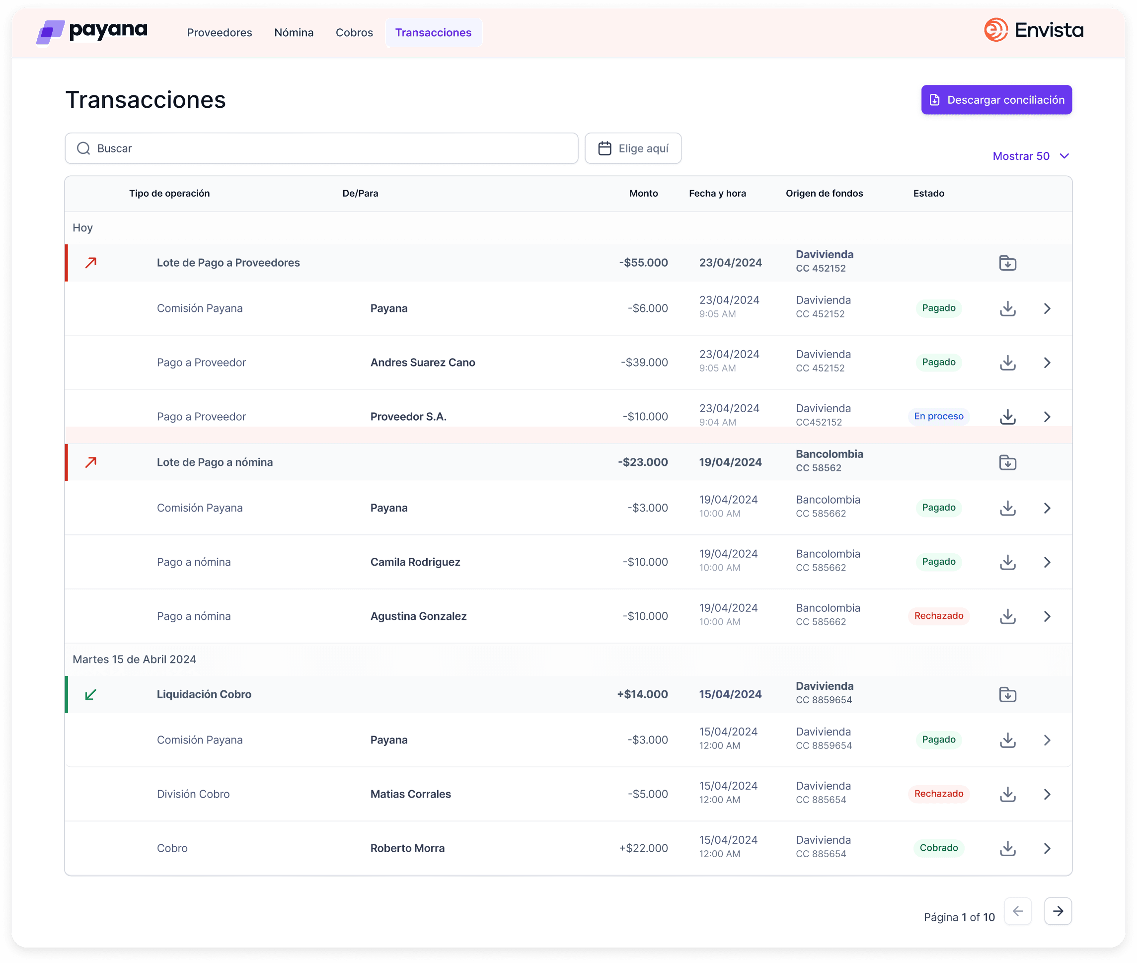
In a payments product, uncertainty kills trust. If you can’t tell whether your payment is processing, stuck, or gone — you start doubting the whole platform. I built a step-by-step timeline — visible in both the list and the detail panel — that shows exactly where the money is: received, dispersing, rejected, retried, dispersed. For rejections, the path makes the failure explicit and the fix immediate — reprocess from the same screen, no support call needed.
One more layer of complexity: the actual payment processing was handled by a third-party provider called Cobre. Once a payment entered the processing stage, Payana lost visibility — we had to wait for Cobre’s response to know if it went through or got rejected. That lag made the money path even more critical to design well.
It also meant that getting the beneficiary data right upfront was essential. If the recipient’s bank details were wrong, the payment would fail at the Cobre level — and fixing it meant the user had to correct the data and reprocess. That’s why the rejection flow wasn’t just about showing an error — it was about making the correction and retry seamless, right from the same screen.


Search as a first-class feature.
Search wasn’t a filter — it was a navigation tool. A user looking for a specific supplier, NIT, ID, or tag needed results across all transaction types at once. Search results came back categorized — Proveedores, Destinatario adicional, Transacciones — so you could jump straight to what you were after.

Final design — everything in one place.
One unified, scannable list of every payment — grouped by date, status always visible, sub-transactions a click away in a side panel that keeps you in context.


05 — Post-Launch Analysis
After launch, I built Amplitude funnels to track whether the new design was actually shifting behavior — not just hoping it worked.
Funnel Reproceso (direct reprocess flow).
18.4% of users who opened the transactions tab completed a reprocess. That feature didn’t exist before. 18.4% completion on something that previously required a support call is a real number — it means users are actually handling their own payment failures now.
Funnel Search Reprocess.
3.54% of users who came through search completed a reprocess — lower than the direct path, but informative. Users who search are usually exploring, not acting on a specific known problem. That shaped how we thought about the next iteration of search.
The data also showed that 44% of users don’t go deeper from the list to the detail view — which became the next question: what’s stopping almost half of users from going further? That’s the kind of thing post-launch analysis is supposed to generate.


06 — Outcome
On a payments platform, visibility over money isn’t a nice-to-have — it’s operational. Users need to know where their money is to reconcile with their banks and other platforms. A panel that can’t be found, or isn’t understood, isn’t just bad UX: it’s a product trust problem.
- →371 active users using the feature, with a usage frequency of 4.76 — those who use it, come back.
- →19,466 tab views in 30 days — the transactions section became one of the most accessed areas of the panel.
- →18.4% self-service completion on rejected payment reprocessing — for the first time, users could resolve it without calling support.
For a payments platform, that’s not just a UX win — it’s a trust signal. Users feel in control of their own money.


07 — What I Learned
Retrospective:
The sharpest insight from this whole project came from a user who didn’t know the feature existed. That quote — “Are there transactions? I didn’t know” — changed the frame entirely. It wasn’t a design problem. It was a discoverability and architecture problem that looked like a design problem.
Testing the concept before the design saved real time. Two rough mockups in round 2 of interviews. If users had pushed back on the unified view, we could’ve pivoted without burning a sprint on high fidelity. Instead we got clear signal and moved fast.
Dev constraints can make your design better. The dropdown performance issue pushed us to a panel-based view that ended up being the right call. I used to think constraints were things to push against — this project changed that.
Define success metrics before the first wireframe, not after the last handoff. I built the Amplitude funnels after launch because there was no prior quantitative data — this redesign was the starting point. But that doesn’t make it the right sequence. I pushed for instrumentation as part of the project, and the takeaway is that the measurement plan has to come in from day one — every time.
Thank you for reading!
Go Back