Flow Cauciones -
InvertirOnline
A financial product available on web for years — but invisible in the app. We redesigned the caución flow from scratch to make it work where users already were: mobile.
- Date
- Q3 2023
- Role
- Product Designer
- Scope
- UX Research, UX/UI Design
- Team
- 1 Designer, 4 engineers, 1 PM
- Tools
- Figma, Figjam, Jira, HotJar
- Status
- Productive
01 — Research
Stakeholders flagged that cauciones — one of the platform’s core investment instruments — only existed on the web. Users who worked exclusively through the app had no way to access it. The ask was simple: bring it to mobile. But before designing anything, we needed to understand how users actually used the web flow — and whether just replicating it would be enough.
We started where the behavior was already happening.
We analyzed the existing web product and ran a survey with open-ended questions targeting users who had already made a cación on the web. Two things stood out immediately.
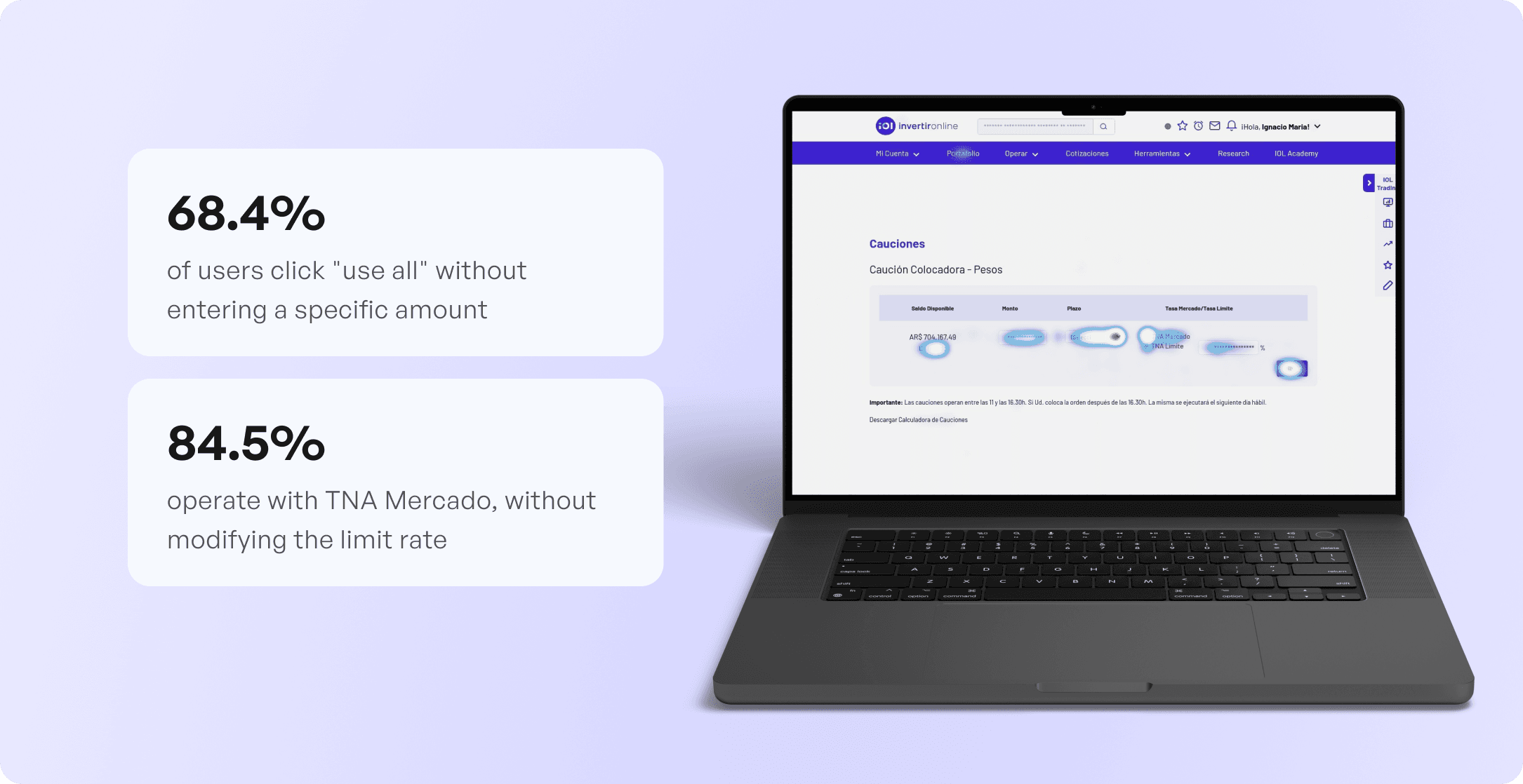
Survey finding 1 — The “use all” button is load-bearing.
85% of 208 respondents rated the “usar todo” button as very useful
(4–5 out of 5).
Survey finding 2 — The flow felt easy. But that’s the web.
74% of 218 respondents rated the ease of making a cación as very easy
(5 out of 5) on desktop.
The question we needed to answer: would that translate to mobile?
What users were actually asking for:
These weren’t feature requests. They were signals about where friction would show up on mobile.
Then we looked at the data.
We analyzed heatmaps and quantitative behavior across 732 screens over 1 month on desktop, and 134 screens on the responsive version.
Desktop insights:

The pattern was the same across platforms: users don’t want to configure — they want to confirm. The default behavior was the dominant behavior. That became our design principle.
To add qualitative context, we ran 3 short interviews with active web users. Not statistically significant, but they consistently reinforced what the heatmaps already showed: users wanted speed, ‘use all’ was essential, and the app felt like a gap in their workflow.
We also audited 3 competing apps (Cocos, PPI, Taurus) to understand how the market structured the same flow — and set a benchmark for step reduction.
We also consulted the data team to understand term behavior.
Beyond the heatmaps, we dug one level deeper: we asked the data team which term users were actually selecting most often. The answer was consistent — the majority were caucionando at 1 day. Not because it was the path of least resistance, but because it was the most financially effective strategy: daily reinvestment compounds significantly more than locking in a longer term upfront. A 15-day cación looks simpler on the surface, but daily reinvestment consistently outperforms it.
That finding reinforced the decision to pre-select 1 day as the default — not because it was the minimum, but because the data confirmed it was the optimal behavior for most users. Removing that decision from the flow meant users got the best outcome without needing to understand the math behind it.
It also surfaced a future opportunity we flagged during the project: an automatic daily cación feature that would reinvest returns on the user’s behalf every day. The smart default was the first step toward that vision.
02 — Conclusions
What the data told us, and what we decided.
The research didn’t just validate assumptions — it sharpened the decisions we had to make.
03 — Proposal
What we designed — and why
User Flow
We mapped the complete flow from app open to order confirmation, including registration states and error handling.
The happy path:
Overview → Mercado → Cauciones → Make a cación → Enter amount & term → Confirm order.
Working within real constraints
This project involved constant back-and-forth with the dev team to figure out what was actually feasible — and those conversations directly shaped some of the design decisions.

The clearest example: the term selector. My initial proposal was a calendar picker — more intuitive, clearer visual mapping between dates and days. Dev flagged it as significantly more expensive: it would’ve required a brand-new component. The more pragmatic path was to reuse an existing dropdown already in use across the product. We negotiated. The result was that existing dropdown — cheaper to build, no new component — but with one key addition I pushed for: the day of the week shown alongside each date.
This wasn’t just an aesthetic preference. In a financial product with market hours, the date you think you’re investing isn’t always the date that counts. If you initiate a cación after market close on Thursday, the operation executes on Friday — so “3 days” becomes ambiguous. Showing “3 days — Sunday” gives the user the information that actually matters: not an abstract number, but a concrete moment in time. A small addition that resolved a real point of confusion without requiring any new infrastructure.
That tradeoff taught me something I apply consistently now: the goal isn’t to win every design decision — it’s to identify which details actually matter for the user and hold the line on those, while being flexible on everything else.
Real-time return calculation
One of the most impactful decisions in the flow was showing the estimated return the moment the user enters an amount — no screen change, no confirmation step. Right there: “If I cauciono $10,000 for 3 days, I receive $X.”

In a financial product, that visibility directly affects whether the user actually completes the transaction. Uncertainty at the amount-entry step is where hesitation happens. Removing it before the confirm button reduces the cognitive cost of committing.
Design System
We worked within the existing InvertirOnline component library. Consistency in a financial product isn’t a constraint — it’s a feature. Introducing unfamiliar patterns creates distrust at exactly the wrong moment. We extended the system where mobile required it, without breaking the established visual language.
The final design addressed every insight from research:
- Amount input defaults to “use all” — the most common action is the first action
- TNA Mercado pre-selected — edit if you want to, ignore if you don’t
- Estimated return visible in real time, same screen — no navigation to see what you’re earning
- Term selector with day-of-week label
- Full order summary before confirming — trust at the critical moment
- Clear success state — users know the operation went through
04 — Closing
What this project was really about
Bringing a financial instrument from web to mobile isn’t a replication exercise. The behavior data showed us that users already had a clear mental model around cauciones — our job was to design an experience that respected that model while removing every unnecessary point of friction.
Not every decision was ideal in isolation. Some were shaped by dev constraints, timelines, and negotiation. But the ones that mattered most for the user — real-time feedback, smart defaults, human-readable dates — made it in.
Thank you for reading!
Go Back